From an 8 bit computer game to now a international simulated 3d game The Sims have had its history with their logos.
The first sims game was released in February 2000 as an 8 bit game of just pixelated characters created by a gaming company called Maxis then published by EA games . The first generation logo is a bubble way giving it a blue thick outline the logo on top being the acknowledgement of the game was a house. since the Game was a game able to control more than one characters and live out your fantasy life.
 The second Generation of the sims was Sims 2 being realised on September 14, 2004 from 8-bit 2D format , EA has made the game a 3D game adding six stages in life from infancy to elder and adding a more envirment to live your fantasy life. The logo for the sims 2 has changed drastically . from the bubbly rounded texture they gave it a more sharper look, In the second generation logo you can see they added the iconic green diamond to represent the sims also miniminzing the word “The” and adding the a huge number two on the bottom of the text .
On June 9,2009 Maxis and EA games released the third generation the sims 3 ,for the third generation of the sims series the logo was a major change they still had the white  sharp text from the second generation but this time instead of inlarging the number three they enlarged the green diamond putting it in the background and minimizing the word “The” and making the number three looking like a little exponent.
On May 6 2013 EA has announced they are making the fourth generation of the Sims series it will be released next year in 2014 ,but they have released the logo design making the drastic change making the text smoother removing blocky white text ,turning it into a smoothe blue text ,getting rid of the green diamond and adding, enlargint the number four.
Category Archives: Uncategorized
History of the Dorito’s logo
Doritos has been around us for the longest time it had has us entertained with its funny Super Bowl commercials to having us love their delicious snacks, The Doritos franchise has been with us since 1964 .
The original product was made in Casa de Frito at Disneyland in California using unused tortilla chips in the year 1964. The chips were then sold to Frito-Lay later making its nationwide realize in 1966. that’s when the logo first appeared as a classic look and squares around each letter with two tone pattern colors. that logo lasted from
1964-1973
The next logo was released in 1973 this logo they changed it from the orange and yellow to the like a yellow and gold square colors also squishing the squares together and fading the letters to make it more the style to fit around the 1970’s.
In 1985 they change the logo again this time keeping with the red-orange and yellow as their two signature color this time they make the color squares making the shape of the squares more slanted and enlarging the text also instead of dotting the “i” with a circular period they changed that to the design of what their chip
s look like this
design lasted till the year 1992.
In the year 1992 the did a whole new design on the Doritos logo keeping the colors and text the background design is the triangular shape of the tortilla chip with the drop shadow color being yellow.That design lasted 1996. In 1996 same as the previous logo but with a black background.
In the year 2000 they changed the logo again .same as the logo before but with he black background forming a tortilla chip with blue highlight and the text being white that was the only major change in that logo that lasted till the year 2005.
The 2005 and for on we now see the logo with a new change as the name Doritos is given a smoother look . the text was given a bolder look . the signature sign now is the voltage above the logo. But today’s logo has changed from the 2005 logo giving it a sharper look and instead of blue its a red-orange sharp drag.
Google Gives Android a Upgrade
This month Google has updated the Android phone giving it new features. For example the new update they have given the Android phone would be its product a new feature the Google+ , The feature contains automatic back up to save the picture on to your phone secure and privately this has been on the iOS but users have to keep the Cloud app running.
The other feature for the Android is that Google is bringing all its new photo editing
features will be placed on Google+ for users to use. the other feature Google has updated for the new Android software , the app is called Hangout . Hangout is similar to Facetime on the iOS but with new kicks. Hangout is the new feature on the Android smart phone with this new app you are allowed
to video chat or send messages to any smartphone and tablets around the world.The
new look for the Android is more understandable to use ,from what i experienced
using my Android. The new and improve update has set up its new
market and hoping for Google to keep it this way. I give the new update a two thumbs up.
History of the Starbuck’s logo
This blog is something i am not use to so bare with me .
In 1971 a not a named wide shop released their logo out into the public . the logo consist of a fully figured siren. The company that released the logo is yes indeed Starbucks . The logo and the coffee shop we know today has had its renovation,also a lot of logo modification . This blog will be about the origin ,meaning and the modification it went through.
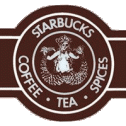
The Starbucks logo was released in 1971 in Seattle ,Washington.The logo at first from the 1971 picture , shows the color of a dark umber and their signature mascot the siren. The siren is known in Greek mythology as dangerous and beautiful creatures luring sailors to their deaths. It is ironic and nostalgic that the siren is the mascot for Starbucks as you can see their coffee is luring and addicting as they real in customers.
Any who the first Starbucks logo was a fully drawn highly detail siren .the outside circle is brown with white text . This logo went on as  being their logo fo
 r a numbers of years till the year 1987 ,which then the logo went under a couple modification . in the year 1992 they changed the logo completely, Instead of the brown color they switched to green and the difference between the 1971 logo and the 1992 logo is the siren is turned into a more simplistic and more bold . Also instead of having a fully figured siren they cut that off and showed from the chest up leaving out the details of showing her breast due to some controversy .also you can see that the inner circle of where the siren is has been changed to black and white . the text on the outer circle is still white under it they have two stars, that was the logo for the year 1992-2011.
In the year 2011 they re-changed the logo again this time taking out their name and just enlarging the siren leaving it with a lighter shade of green and having the siren and making it a little more geometric, This is the logo of today if you notice it on your Starbucks coffee cups and merchandise today ,maybe not on the little frappuccinos but on the Styrofoam cups at the cafe’s
so this concludes the history of the Starbucks logo from the release of it in 1971,the meaning of their mascot and how it changed over the years.


